[ do scoll ]
_overview
As a senior software engineer at Weedmaps, I was on a team that focused on building features for our post-conversion surfaces of both weedmaps.com and our mobile applications. Although we had our hands in all areas of the core product, we mainly focused on these areas: checkout, cart, post-order experience and payments.
_tech_used
- React
- NextJS
- React Query
- MobX
- Styled Components
- Jest
- Cypress
- Docker
- Kubernetes
_more_details
As part of the post-conversion team, we built new features for many high-impact areas of our core B2C product: weedmaps.com, the iOS app, and the Android app. One of the biggest projects we decided to do was rebuilding our checkout page. This was a project I initially proposed to solve some major tech debt and to consolidate the two checkouts we had: authenticated and guest checkout. After much discussion with product and stakeholders, what was a tech debt solution turned into a fully fleshed out product update. We created new designs to rebuild checkout with an improved UX/UI, better user communication with inline error handling, and a simplified multi-step flow.
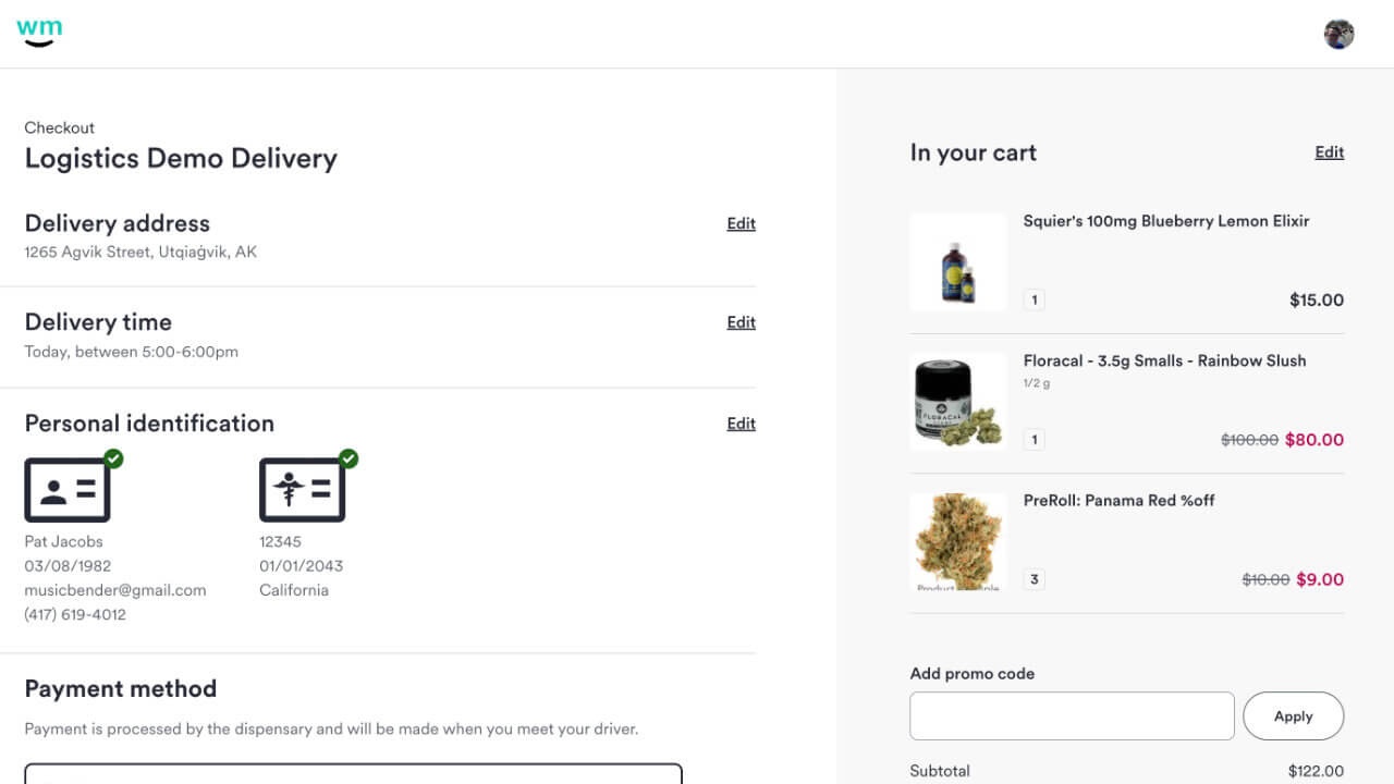
[ Introducing the new Weedmaps checkout experience for web and native ]
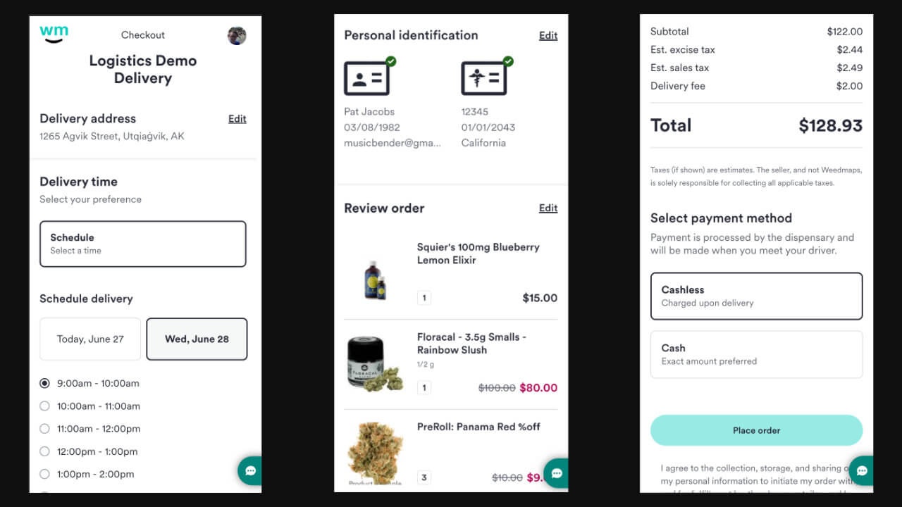
[ Multi-step flow with scheduled orders selection, edit states, and payments ]
A big part of this feature was the improvements we made to the personal information gathering. This is general information about the user needed to properly complete an order. Most of the time the user's account already has this information from onboarding, but at times some fields are missing. When we detect missing required fields this section will expand. We relied heaviliy on the power of a great form library called React Hook Form. This allowed us to easly and cleanly create form schemas and complex validations. On submit, we'll validation the form and show every error at once and scroll to the first error. This make the form more performant, more accessable, and a better UX so the user doesn't have to keep submitting to find what's wrong.
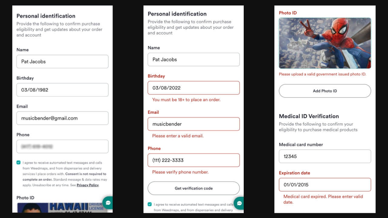
[ Personal info form with accessible inline error states ]
There were many reuseable components and micro-flows we build for this such as phone verification, ID verification and upload, and medical ID validation. We used AWS Rekognition, a machine learning image recognition service, to tell us if an image the user uploads is a government ID. We met our deadlines and all of our goals including eliminating tech debt along the way. In the end, we released a new checkout and post-order experience while increasing orders being placed by 15%, decreasing canceled orders by 25%, and decreasing customer support tickets.
On the other side of ordering, we did a rebuild of our entire post-order experience. Our product manager and designer did a lot of research to figure out what information was valuable to our users after placing an order. The end result of the designs were a UX that gave user's more confidence about their order, more power to resolve any issues, more abilities to contact a business or give feedback.
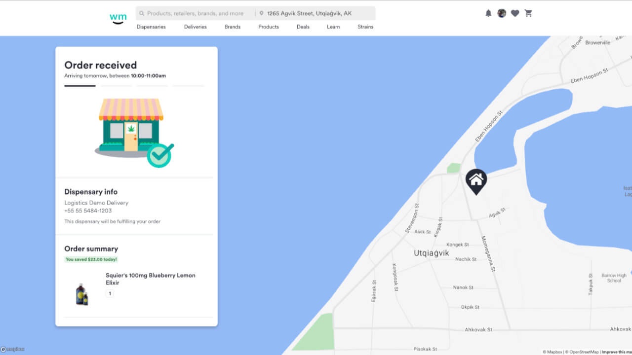
[ Post-order experience with a status of "order received" ]
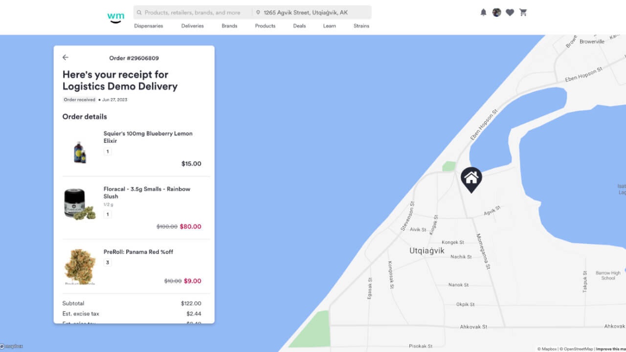
[ The receipt view for the post-order flow ]
You can see, we show the user what the order status is from beginng to end. This makes interval requests to our ordering service GraphQL API to get order status information so the status will automatically change. Eventually, the order resolves, or in rare cases gets canceled, and we show an entirely different state. There, you can see the resolved order as well as write reviews for the listing or products themselves.
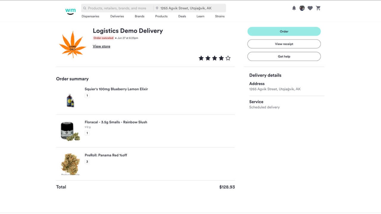
[ Order complete/canceled state for post-order flow ]
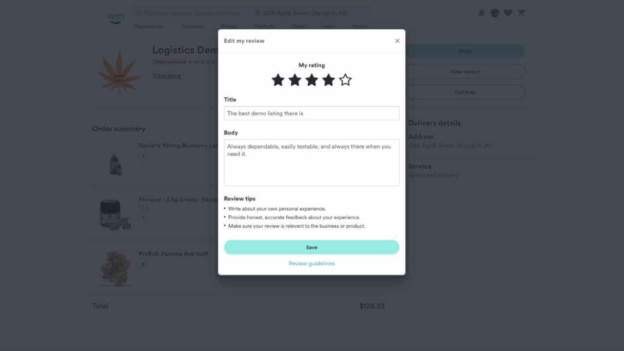
[ New review system UI after your order has concluded ]
In addition, we show a notification on the home screen that updates continuously to give them a status of there active order.
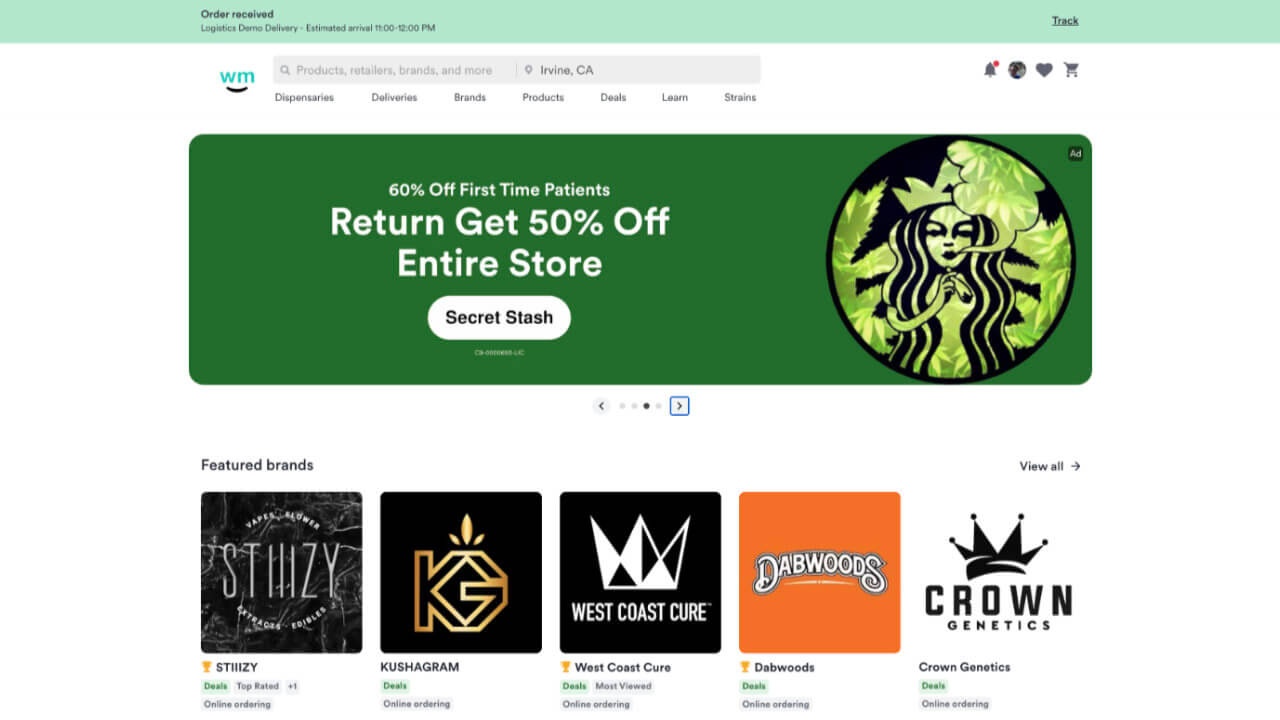
[ Homepage order status banner that auto-updates ]
There were several other feature I help plan, archetect, and build while leading and mentoring the other engineers on my team. This includes, cart page rebuild, low stock indicators and checks, scheduled orders (both B2C and B2B update), dynamic and express menus (both B2C and B2B updates), a product recommendation system based on user's buying history and listing's popular products, and many others.
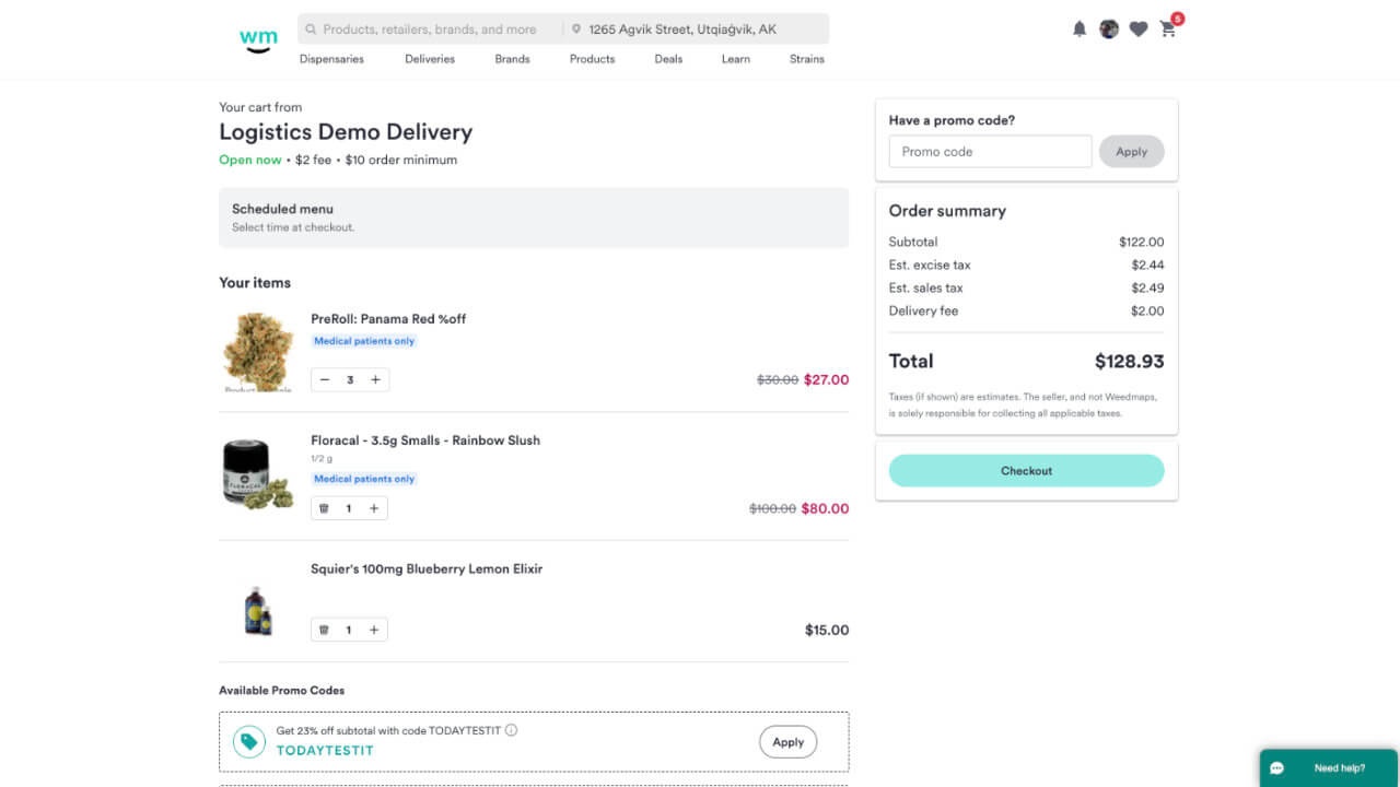
[ Cart page user experience updates ]
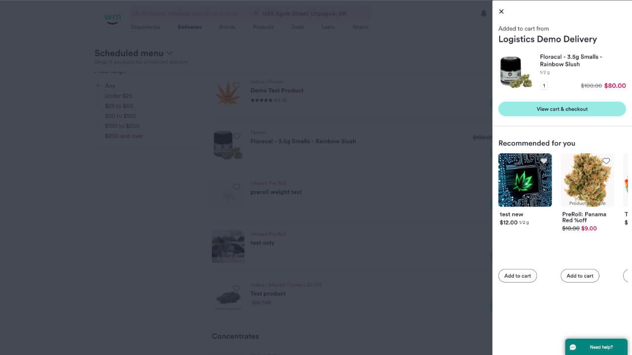
[ New add to cart modal with recommendations based on user and listing intelligence ]
_the_team
- 3 Engineers
- 1 Designer
- 1 Product Manager